How effective is the combination of your main product and ancillary texts?
Here is a Prezi on how my trailer, poster and magazine all compare. I have shown how all three have got different components in common.
You can zoom in on the Prezi to read it better.
You can zoom in on the Prezi to read it better.
If you cannot access the Prezi on this site, then please click the button below:
I have annotated my magazine and written about why I have chosen the different elements on it. below is the document in which I have done this.
With the branding of a movie, the way the text is presented is a major feature. With the right font, people can associate the font with the film, no matter what is written in that font. Below is a few examples of famous font that is associated with different films.

|
This is the font from the popular Harry Potter franchise. No matter if it is grey or yellow, the font is instantly recognisable, because of the individual features of the font. The font looks a lot like lightning, especially on the the letter 'P'.
|
|
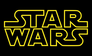
The Star Wars font is a this yellow out line of some letters. The modern feel to this franchise that started in 1977 is very recognisable by many people in the world.
|
|
|
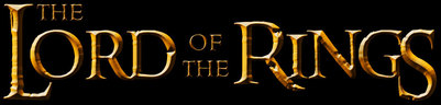
This is the font for Lord of the Rings (LOR). This font is recognisable for it metal like features and the roughness of the font makes it look very old. When words are written in this font, people will associate it with LOR due to how recognisable the the colour and shape of the font.
|
|
The font for Jurassic Park looks quite primeval with the the 's' looking like scratch marks. This bubble type of writing is quite square. It is something that you would see on a sign, which is why the film has used it.
|

|

The font I have used is very unusual, which will mean that it will be recognisable. The font looks like it has been scratched in which is good, for scratches can be associated with possession and that is what my film is about. This font being unusual and unique means that when the audience will see it they will associate it with the film.
The font is a very big part of the roducts that I have made, for I have used a lot of it. The trailer as used it for the font. The poster and magazine has used it in the background and the poster has also used it for some of its information.
The font is a very big part of the roducts that I have made, for I have used a lot of it. The trailer as used it for the font. The poster and magazine has used it in the background and the poster has also used it for some of its information.
